JONES AND TUGGLE CPAS
A Legacy Reframed.
Brand Strategy / Brand Identity / Logo Design / Collateral
JONES AND TUGGLE CPAS
Brand Strategy / Brand Identity / Logo Design / Collateral
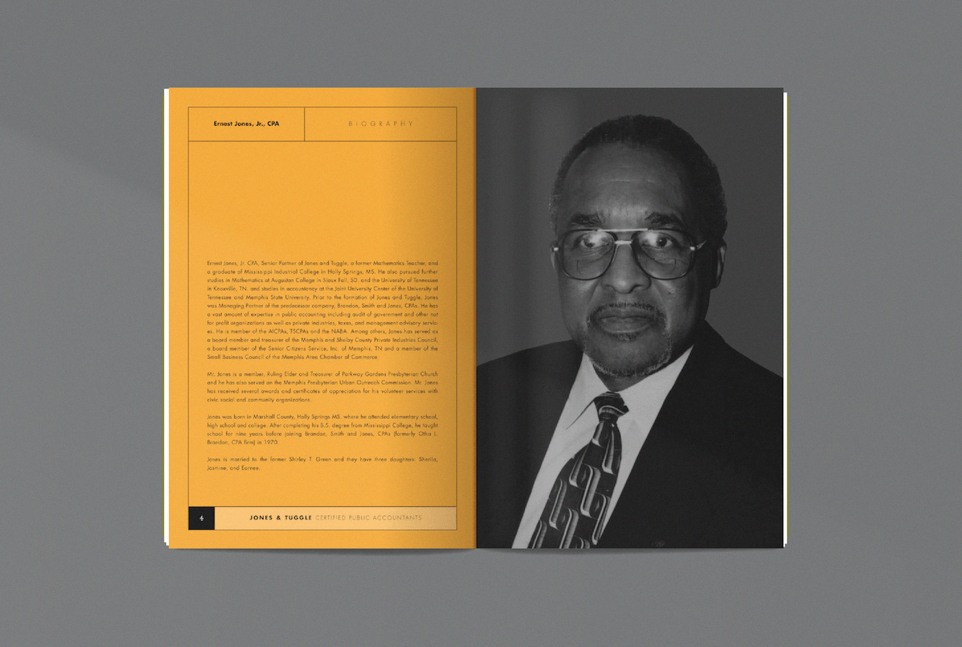
When Jones & Tuggle CPAs looked to reinvigorate their brand‚ the goal wasn’t reinvention; it was reinforcement. The firm has a long-standing presence in Memphis‚ and our responsibility was to honor that legacy while positioning it with renewed confidence for the future.
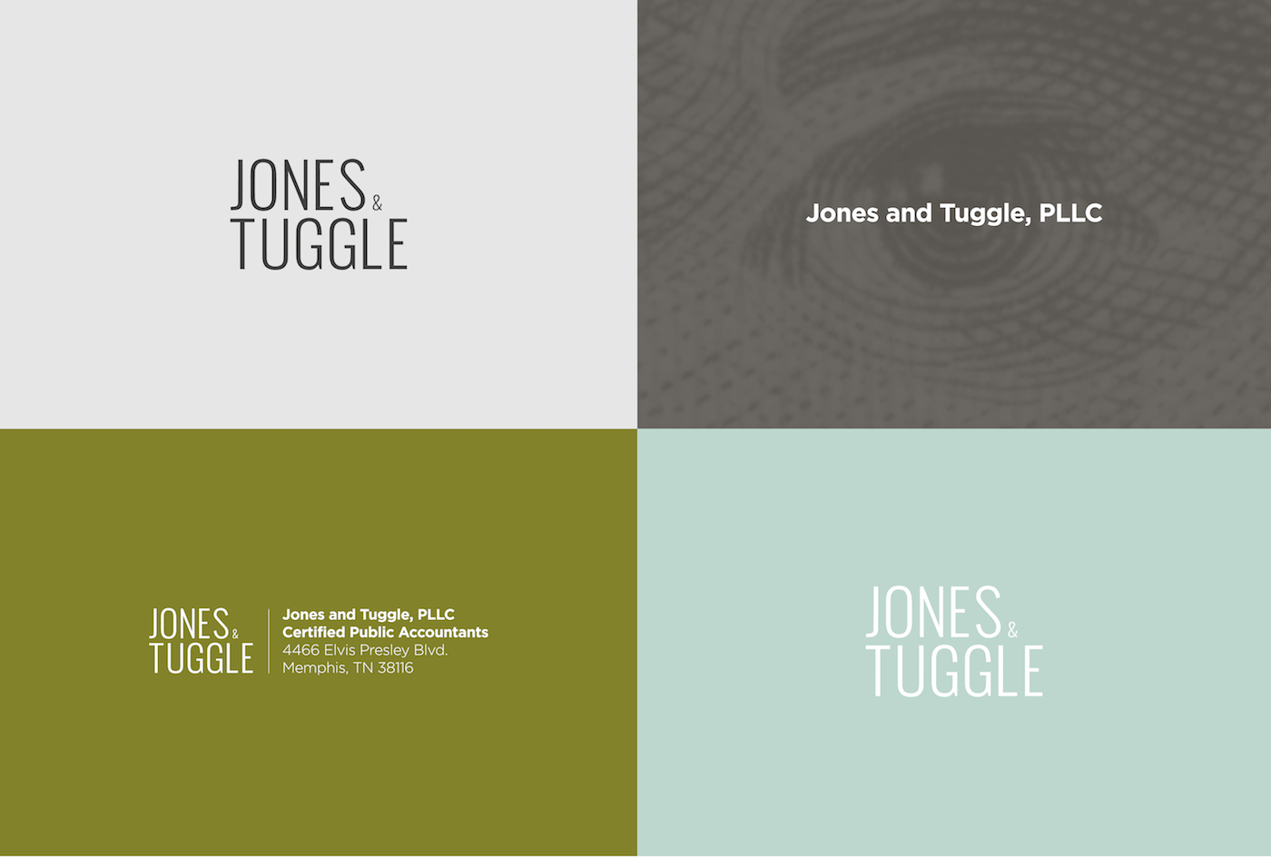
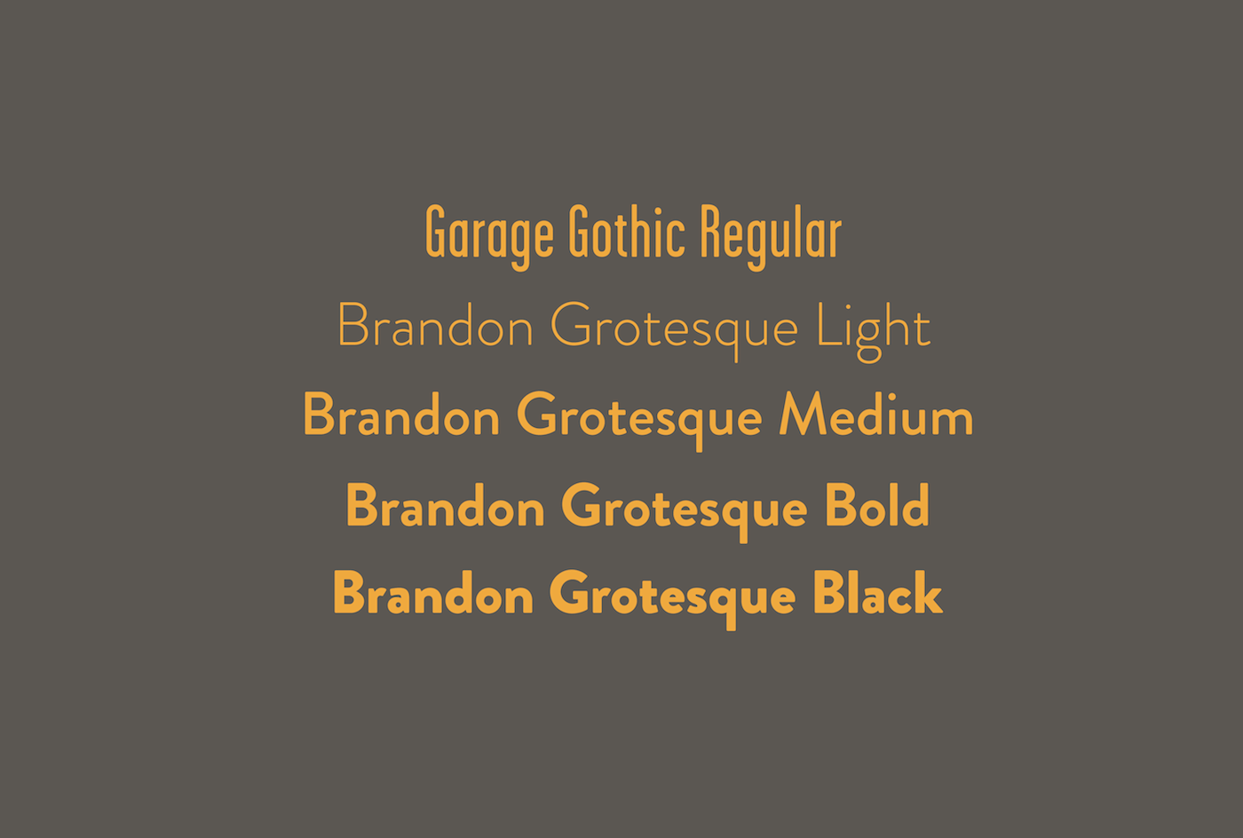
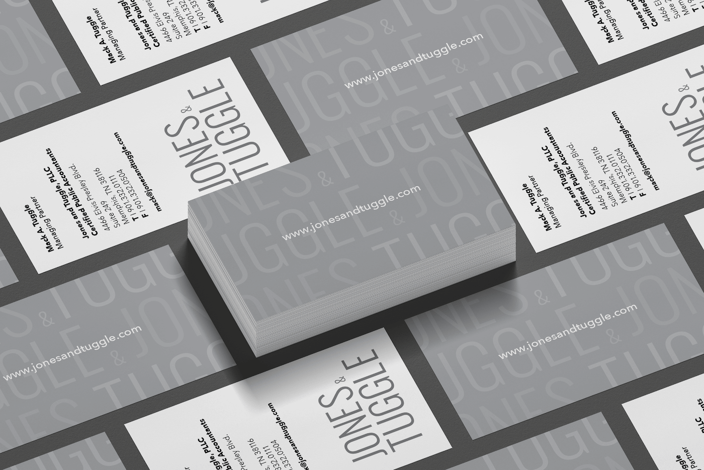
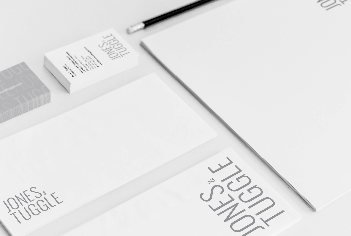
We began by developing a bold‚ oversized wordmark. The scale signals presence and reflects a firm secure in its heritage and clear about its direction.
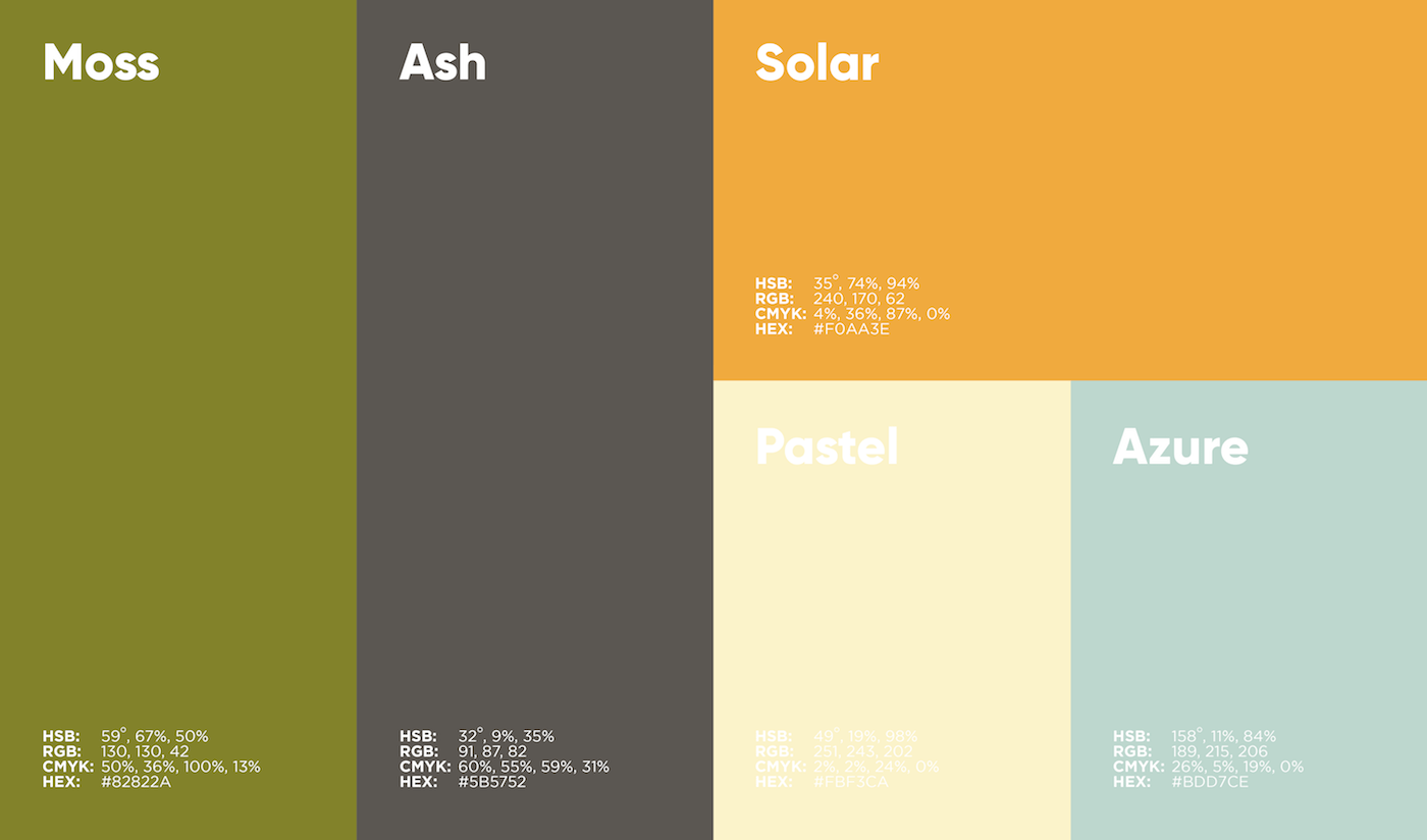
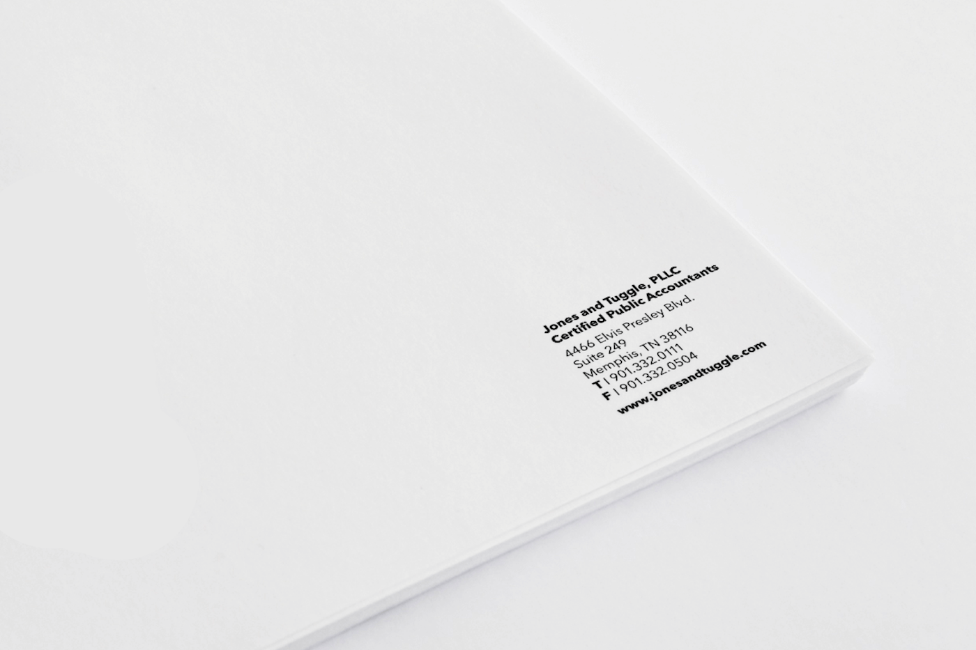
We paired the typography with a disciplined, understated color palette that mirrors the management team’s leadership style: steady‚ thoughtful‚ and measured. The result is a brand system and collateral that feels respectful without feeling dated.
But the most meaningful outcome perhaps wasn’t visual.
It was internal.
The process clarified how the leadership team saw themselves. Not just as a firm with history‚ but as a firm defined by it.
The refreshed identity didn’t change who they were.
It elevated how they expressed it.